|
Last week, Spottah 2.0 was released. The redesign was made possible by the talented Chris Allen. He discovered Spottah at a bachelor party, loved it, and pitched us on a redesign. Two days later, he shipped a reimagined home page. It was stunning. Chris crafted crisp designs and Yin brought them to life. And for the next few months, I had the honor of watching the Lennon/McCartney of app builders compose their masterpiece.
2 Comments
In 2006, I started a biodiesel operation for The Doe Fund, a non-profit organization in NYC that creates businesses to employ formerly homeless or incarcerated men. There I was: a kid from rural Massachusetts leading 10 men from the toughest neighborhoods in New York. One of my employees, who was about my age, hailed from the South Bronx but had spent the last 10 years in Federal Prison for shooting a rival dealer. Another had started using heroin when he was nine years old.
Today, my team at Spottah is the exact opposite: highly skilled knowledge workers. The degree-to-employee ratio is 1.7. Technology recruiters, not DEA agents, are breaking down our doors. Email is our addiction. These distinct experiences defined my management philosophy. The manager’s job is to understand the goals of his team members, and align those goals with the organization’s goals. The fact that this philosophy works with people three sigmas right or left is testament to its strength. Take Lester from The Doe Fund, for example. Lester’s goal was to land a job with New York City Sanitation. Some of you may be thinking, “‘garbage man’ doesn’t sound like a great goal.” But it is. It’s high-paying, secure, and provides benefits. Once I knew Lester’s goal, I was able to align his goal with the goal of my biodiesel unit. We focused on establishing a safe driving record, following safety protocols, truck maintenance and crew management. Fast forward to Spottah. A few months back, we brought on a new graphic designer named Chris. Chris came to us as a product manager at a major web property. The extent of his design experience were a few side projects and a ton of photography. He knew photoshop and had an eye for design. Being a product manager, Chris had two personal goals. First, improve as a designer, specifically by focusing on logos & icons, textures, fonts and the balance of the screen. Second, he wanted to push the boundaries of the mobile user experience. Initially, I favored an incremental redesign -- you know, change an image size here and a font there and eventually achieve a new look. Incremental change, however, did not align with Chris’s goals. Furthermore, incremental change was not best for Spottah; our success rests on an amazing user experience. So we tasked Chris with razing the old design and completely re-imagining our product. Thanks to Chris’s designs and Yin’s ability to implement anything, the new version of Spottah looks and feels amazing. Here is a taste, but you’ll have to wait a bit longer for the full meal. Sorry. Gaining an honest understanding of your team members’ goals is not easy. A person’s goals may not include the current company; Lester, for example, had a goal of working for DSNY, not The Doe Fund. Also, a person may fear that their goal counters the goal of their manager or another team member; Chris wanted a complete redesign while I initially wanted to move in increments. It is essential to create an environment where people can honestly share their goals. If a company fails to achieve this, than people will project false goals and the manager will not be able to develop a meaningful plan for achieving individual and company goals. I first became interested in industrial design upon learning of "suicide doors." Early cars were often designed with doors that hinged behind the passenger. On one hand, this was an excellent design: it allowed passengers to enter and exit vehicles with great ease. However, there was one major flaw. In the event of an emergency exit, the doors would catch and drag the passenger. Hence the name: "suicide doors." 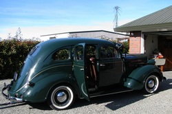 1937 Chrysler Plymouth with rear "suicide doors." Today, there are numerous examples of "suicide door" designs, i.e. grand intentions but disastrous flaws. There are also designs that are so simple and obvious that you find yourself scratching your head and wondering: "Why did it take XYZ company so long to come up with this?" Below are two designs that gave me pause. As I spot more designs, I'll share them here as an ongoing series. Please send me any design examples that you feel deserve mention in the either the Hall of Fame or Hall of Shame. Coca-Cola Vending Machine: A simple design shift reduces motion and prevents you from forgetting change A few weeks ago, a new vending machine was delivered to my office. It seemed like a standard vending machine: seven-ish feet tall, glowing lights, the constant hum of a refrigeration motor. This machine, however, had a minor modification. Typically, vending machines collect money and dispense change in the same area: the right side about 5 feet from the floor. The two functions - taking money and giving change - are similar so it is logical that they be placed in the same vicinity, right? Not necassarily, as this machine proves. In the new machine, the change and the soda are dispensed in the same area. The benefits are less movement and a lower chance of forgetting your change. Under the old design: you insert your money, chose your soda, collect your soda, and then return to to "money area" to collect your change. The new design completely removes the last movement of returning to the "money area" because the collecting the soda and the change movement are integrated into one. This is a 25% reduction in movement. A web or mobile designer that reduces the number of clicks to make a purchase by 25% would be considered a rock star. In summary, the key lesson from the Coke machine is that similar functions do not need to be performed in the same physical area. 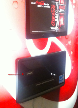 A vending machine design that places the change dispenser near the soda dispenser, which reduces movement by 25%. Touchscreens on Headrests: Or how I tried to relax while someone played Tetris on the back of my skull. No one can complain about personal televisions on airplanes. Good riddance to the days of being forced to watch such classics as Flubber or Legally Blonde 2.* Welcome to a world of live television and on demand movies. The design, however, fails in the way passengers operate the televisions. Some - not all - airlines have adopted touchscreens. The benefit of the touchscreen is that the airline does not need to install and maintain separate remotes. The disadvantage - the "suicide door" if you will - is that the touchscreen is directly in back of the person sitting in front of you. Every channel change or volume adjustments results in a slight but agitating tap to the back of the head. The problem is exacerbated by two factors: first, people unfamiliar with touchscreens who do not realize you just have to gently tap, not violently push; and the introduction of touch-based video games. In summary, well designed products and solutions cannot adversely affect others. I call this the "secondhand smoke test" or "libertarian test." Whatever name you chose, airplanes with touchscreen televisions flunk. 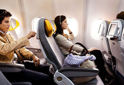 Televisions with touchscreens on airplanes fail the "secondhand" or "libertarian" test. ---------------------------------------------------------- *This is not a gibe at the original Legally Blonde, which was awesome. |
 JONATHAN STEIMAN
I'm the Founder and CEO of Peak Support. This blog is my take on early-stage companies and innovation. Every so often, there may be a post about culture, networking, family -- you name it. After all, what is a blog if it isn't a tad bit unstructured.
Archives
December 2016
Categories
All
|